Work, about and photography

Currently

Exploring how AI agents fit into a designer's day-to-day workflow.

Shopping list

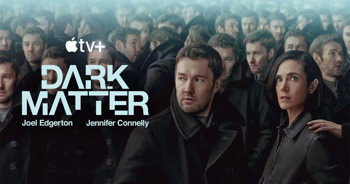
Currently watching

Dark Matter · Apple TVSci-fi thriller

Sydney right now

—°

Checking the sky in Sydney…

Tools I use

  • Figma
  • Claude
  • ChatGPT
  • Notion
  • Higgsfield

Things I like

  • Football
  • Pasta
  • Thrillers
  • Running
  • Design

To do

2026

This website's design system

The tokens and components this site is built from, rendered live from the same source the site uses.

Timeline
2026
Topics
Design systemsAstro

Every colour, space, radius and text style on this site comes from one token file. Primitives hold raw values, semantic tokens say what each value is for, and the light and dark themes differ only at the semantic tier. Everything below is generated from that file, so it can’t drift from what you see on the page.

Colour primitives

A warm-neutral gray ramp. Raw values only; components never use these directly.

0#ffffff
25#fbfbfa
50#f6f6f5
100#eeeeec
200#e2e2df
300#cdcdc9
400#a3a39f
500#8a8a86
600#6a6a67
700#474745
800#2a2a29
850#1f1f1e
900#161616
950#0c0c0c
1000#000000

Semantic colour

What each colour is for. Each token points at a primitive, and light and dark differ only here.

TokenLightDark
--color-bg-canvascolor.gray.50color.gray.950
--color-bg-surfacecolor.gray.0color.gray.900
--color-bg-mutedcolor.gray.100color.gray.850
--color-bg-subtlecolor.black-alpha.4color.white-alpha.7
--color-bg-inversecolor.gray.950color.gray.50
--color-bg-glasscolor.white-alpha.56color.gray-900-alpha.56
--color-bg-backdropcolor.black-alpha.40color.black-alpha.40
--color-text-primarycolor.gray.950color.gray.50
--color-text-secondarycolor.gray.600color.gray.400
--color-text-inversecolor.gray.0color.gray.950
--color-border-defaultcolor.black-alpha.7color.white-alpha.7
--color-border-strongcolor.black-alpha.16color.white-alpha.16
--color-border-focuscolor.gray.950color.gray.50
--color-status-positivecolor.green.600color.green.400
Spacing

A 4px grid. Token names are multipliers, so space-4 is 16px.

space-14px
space-28px
space-312px
space-416px
space-520px
space-624px
space-832px
space-1040px
space-1248px
space-1664px
space-2080px
space-2496px

Radius

Nested corners subtract their inset, so a caption inside a card uses radius-lg minus space-2.

xs4px
sm8px
md12px
lg16px
xl20px
2xl24px
fullfull

Text styles

Geist and Geist Mono. Every line height sits on the 4px grid.

The quick brown foxtext-heading-xl · 32px/40px · 600
The quick brown foxtext-heading-lg · 24px/32px · 600
The quick brown foxtext-heading-md · 20px/28px · 500
The quick brown foxtext-heading-sm · 16px/24px · 500
The quick brown foxtext-body-lg · 16px/24px · 400
The quick brown foxtext-body-md · 14px/20px · 400
The quick brown foxtext-body-sm · 12px/16px · 400
The quick brown foxtext-label-md · 14px/20px · 500
The quick brown foxtext-label-sm · 12px/16px · 500
The quick brown foxtext-code-sm · 12px/16px · 400

Motion

Short and quiet. Everything is switched off for people who prefer reduced motion.

duration-instant100ms
duration-fast150ms
duration-base200ms
duration-slow300ms
duration-slower500ms
easing-standardcubic-bezier(0.2, 0, 0, 1)
easing-outcubic-bezier(0.16, 1, 0.3, 1)

Components

The real components, with their variants and sizes.

Button · variant × size

Icon button · secondary, glass · sm, md

Filter chip · default, pressed · md, sm · and Tag

TagGlass tag

Checkbox · unchecked, checked

Card · media (hover to reveal) and text

Badge

Media card

2026
HoverFocus

Text card

Notes, lists and thoughts use the same shell without media.