Relume Publish editor
I designed how people select, edit and swap components in Relume Publish, so a powerful component system feels simple, even for people who've never used a design tool.
- Role
- Lead Product Designer
- Company
- Relume
- Team
- Component, platform experience and editor teams
- Year
- 2026
The problem
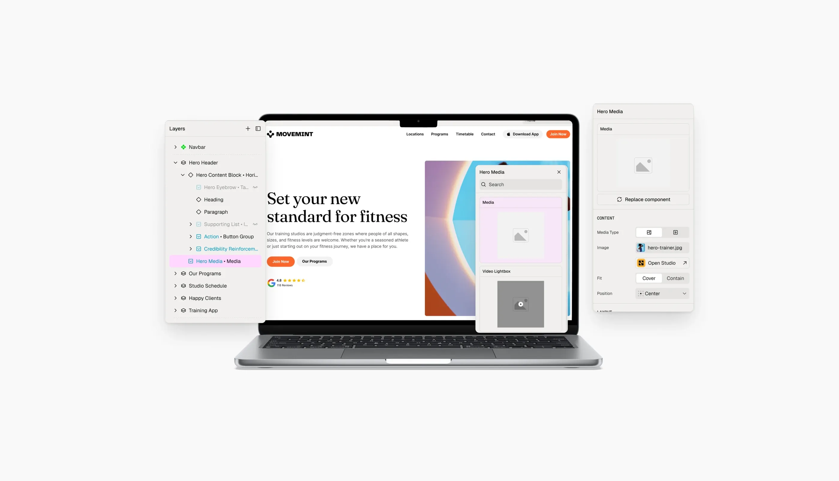
Relume Export, the product before Relume Publish, had very limited editing controls. Our new component system changed what was possible. It’s built from the smallest elements up to whole sections, all reused and composed.
That power came with a new way of thinking about a website builder. The editor had to help people understand:
- The rails. Components are relatively locked down.
- Why the rails exist. Those limits are what make building fast and cut down the decisions people have to make.
- The building blocks. What components, slots and lists are, which parts are editable, and how each one behaves.
And it all had to feel simple for people with no experience in design tools.
My role
The editor was a collaboration across several teams. As lead of the component team, I owned the experience of working with components:
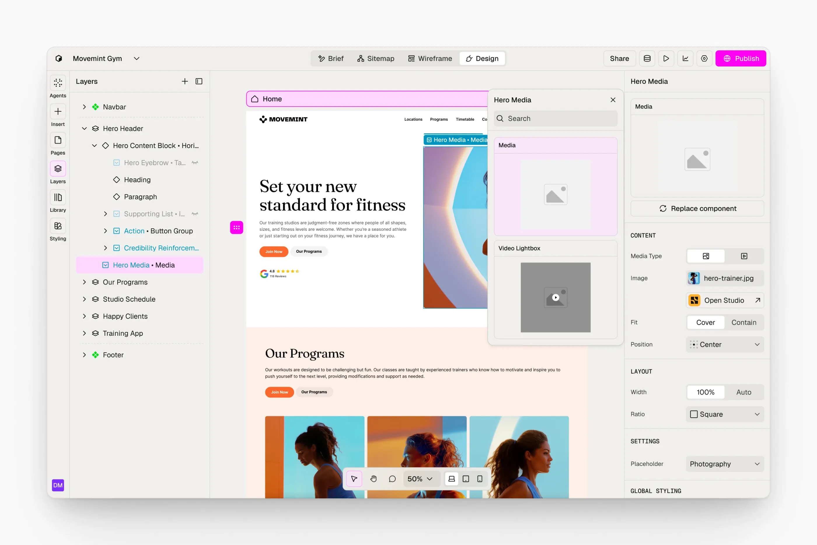
- On-canvas selection
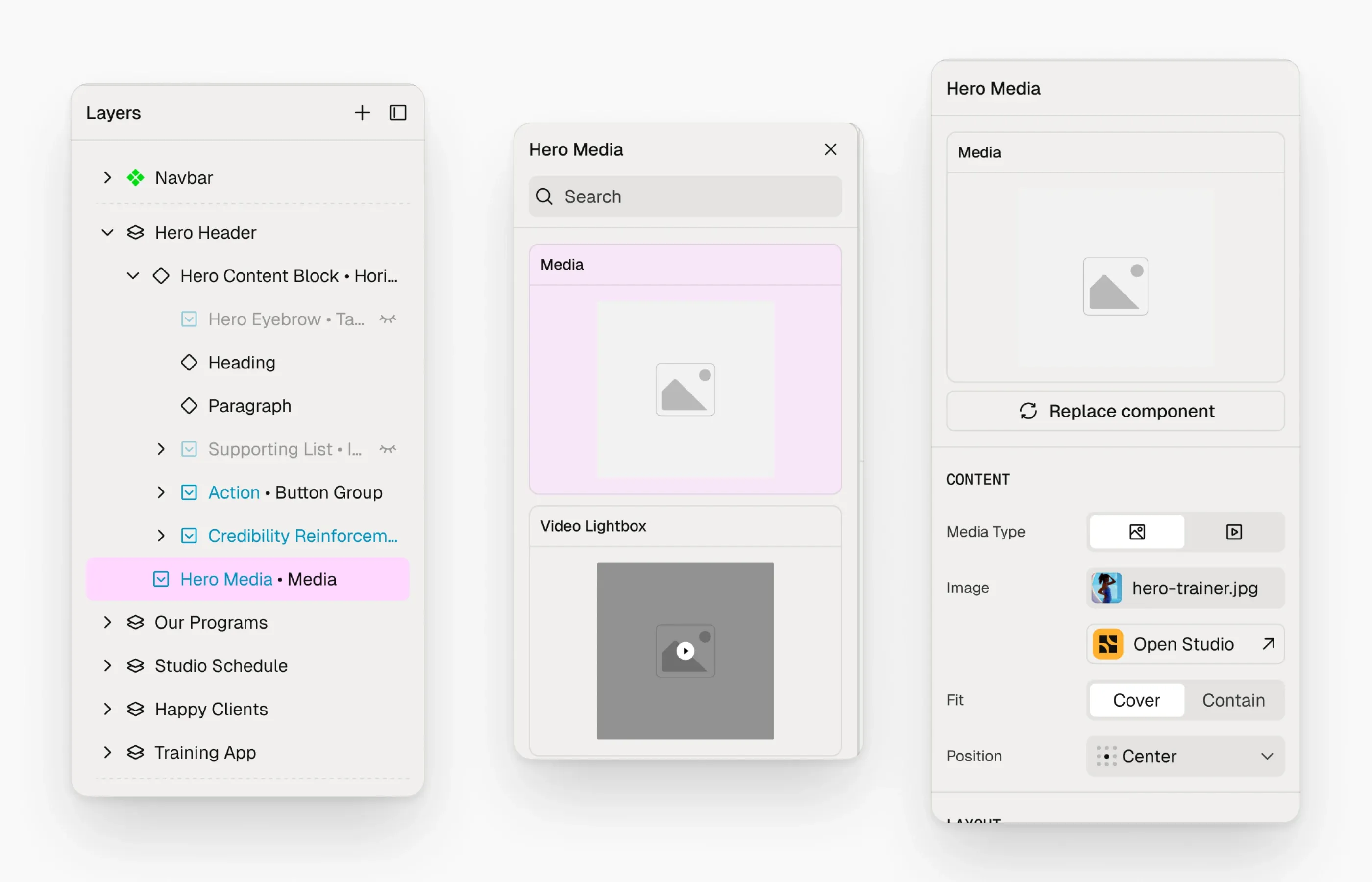
- The properties panel, which shows a selected component’s settings
- The layers panel, for navigating and selecting
That work crossed over with our platform experience and editor teams, who designed the brief, sitemap, publishing and site settings. We worked closely to keep the editor consistent.
Approach
Make the system legible
People need to know what they’ve selected and what it’s made of. The editor makes each component distinct, and shows exactly what’s editable on it.
Group properties by what they do
A component’s properties fall into three kinds, and the properties panel presents them that way:
- Layout, which controls how the component is arranged
- Style, which controls how it looks
- Behaviour, which controls how it acts and animates
Show what can change, and how
Each concept in the system behaves differently, so the editor communicates each one clearly:
- Components can be swapped for any other component that fits.
- Slots let people swap the content within a section.
- Lists are areas where people can freely add and remove items.
Outcome
In user testing, real users understood the system and successfully built out their websites, and the feedback on how intuitive the editor felt was positive. More than 2,000 websites went live on Relume Publish within two weeks of launch.